
Usage Research in Data Visualization
2023|Type: Edited|Tag: Theory
Inside the ads data domain, visualisation is encountered to varying degrees from data ingestion to data governance to data application. A data table is the most common expression to meet the data in a detailed way. On this basis, the expression of data is gradually enriched: more charts are introduced, appropriate colours are matched, necessary explanations are combined, and the semantics of graphs are refined. It is possible to make the key information of the interface more prominent, accurate, rational and vivid. Specifically, we can explore chart usage, colour usage, axes and markers usage, and graphical semantics usage respectively.
Chart Usage
Rules of Nomenclature
- The chart usually refers to the visualisation of various visual elements, such as bars, columns, lines, symbols et cetera. It is suitable for comparing different data sets, showing distributions, or hierarchy. Such as Pie Charts。
The graph usually refers to visualisations made up of points, lines, and curves. Suitable for illustrating trends, patterns, and correlations in data. For example, Line Graphs.
The plot usually refers to a visual representation of a series of points in a coordinate system. Suitable for illustrating the progression, distribution, or relationship of data over time and across variables. For example, Scatter Plots.
A diagram Usually refers to the structure, relationships, or processes of a system or concept, a combination of shapes, symbols, and lines used to describe composition and relationships. It is used in the fields of systems, engineering, and architecture to represent complex concepts visually. For example, Alluvial Diagram.
Purpose
- Comparison
- Connection
- Correlation
- Cumulation
- Diff
- Distribution
- Multidimensional
- Nominal
- Ordinal
- Part-to-whole
- Progression
- Ranking
- Trend
Types
Alluvial / Sankey Diagrams
- Purpose: Distribution, Connections
- Usage: This is a visual expression that describes the flow from one set of values to another. It is designed to show two indicators of a data set and record their distribution, highlighting flow relationships.

Area Chart
- Purpose: Trends, Cumulation, Part-to-whole
- Usage: Similarly to the line graph, the lines are filled with colours and patterns below the line. Overlapping is possible by default.

Compare trends of metrics across objects

Compare the contribution of different objects to aggregate metrics

Compare the percentages of different objects to the aggregate metrics, highlighting the relationship between the percentages
Bar Chart
- Purpose: Comparisons, Nominal, Ranking
- Usage: Comparisons between categories are displayed using horizontal bars arranged vertically. The Y-axis of the chart shows the specific dimensions being compared (in no particular order) and the X-axis represents a discrete value.

Display default in alphabetical order, depending on the case consider the value of the metric in order of magnitude.

Compare multi-dimension with two or more metrics and emphasise absolute differences.

Compare the share of different dimensions under the same metric with the total number of.

Compare the share of different dimensions under the same metric.

Ranked separately for positive and negative dimensions. If order is not important, a dimension can also be ranked to make the values easily comparable.

Compare discrete data or show trends over time.

The same reference value for different dimensions.

Different reference values for different dimensions.

Different objects with different dimensions (for example, this year, last year) of comparison on the same metric, and to highlight one of them.

Different objects need to be classified, or different objects need to be hierarchical.

Box Plots
- Purpose: Distribution
- Usage: The standard way of describing the distribution of data is through 5 numbers, which include: minimum, first quartile, median, third quartile, and maximum. The box plot can clearly show the information of outliers, and at the same time, it can let us know whether the data is symmetrical, how the data is grouped, and the kurtosis of the data.

Bubble Plot
- Purpose: Comparison, Correlation
- Usage: Designed to explore relationships between variables. Relationships between variables can be explored from two to four dimensions through the X-axis, Y-axis, colour and size, respectively.

Bullet Chart
- Purpose: Part-to-whole, Progression
- Usage: A quick snapshot of how an indicator is performing against a target benchmark. There are usually three levels, with level 1 values (dark blue) often used for actual values, level 2 values (target line) often used for target values, and level 3 values (light blue) expressing additional values.

Calendar Chart
- Purpose: Distribution, Trend
- Usage: A visualisation tool for showing changes over time over a long time span.

Candlestick Chart
- Purpose: Diff
- Usage: A financial chart used to depict stock price movements of securities, derivatives or currencies.

Circle Pack Chart
- Purpose: Nominal, Part-to-whole
- Usage: Used to display large amounts of hierarchical data. It's similar to a tree chart but uses circles instead of rectangles. Circle-filled charts use containment (nesting) to display hierarchical data.

Column Chart
- Purpose: Comparison, Ordinal, Progression, Diff, Ranking
- Usage: Comparisons between categories are displayed using vertical bars arranged horizontally. The X-axis of the chart displays the specific dimension being compared (multiple values over time, or values with an intrinsic order, such as age, range, and rating), and the Y-axis represents a discrete value.

Compare multiple values over time, or values with an intrinsic order (such as age, rating, range, et cetera.) to communicate progress or trends through bar charts.

On the basic graph, different dimensions are sorted by metric value and given certain semantics.

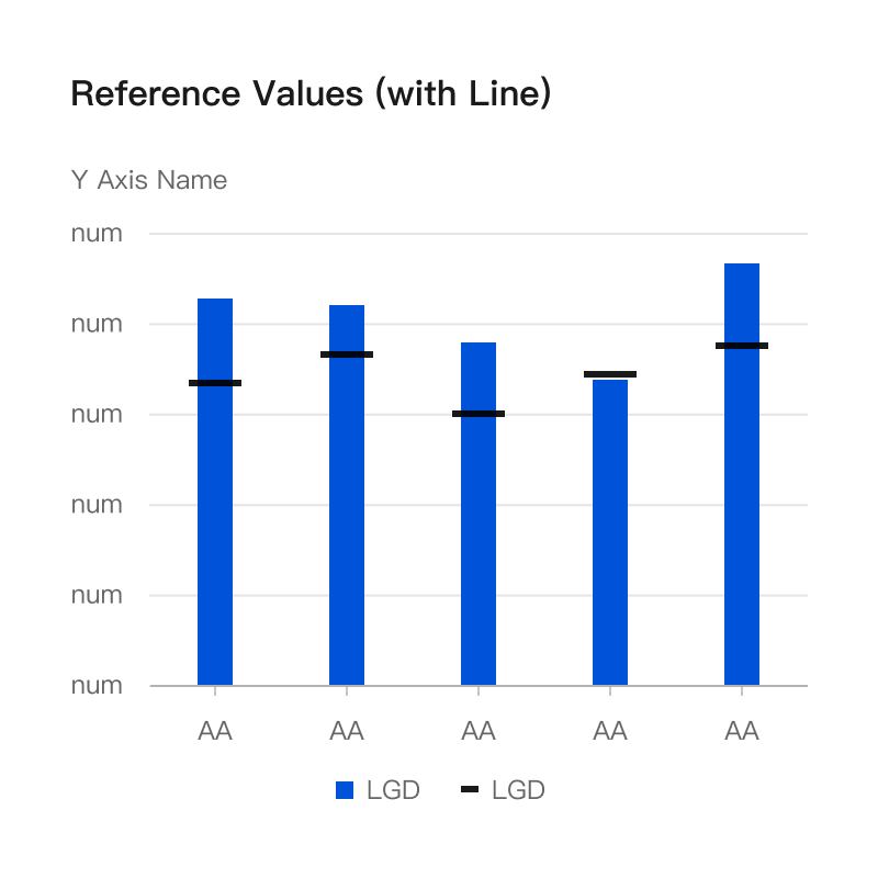
On the basic graph, there are corresponding reference values for different objects.

On the basic graph, it is necessary to express both reference values and predicted values.

On the basic graph, Different objects with different dimensions (for example, this year, last year) of comparison on the same metric, and highlight one of them.
Combo Chart
- Purpose: Comparison, Trend, Correlation
- Usage: A visualisation solution that combines line graphs and bar charts. It is suitable for scenarios where two sets of metrics are difficult to compare directly because of different scales.

Donut Chart
- Purpose: Part-to-whole
- Usage: Similar to a pie chart

Funnel Plot
- Purpose: Diff, Progression, Part-to-whole
- Usage: Used for expressing the different stages of a process and used to locate potential problems.

Basic Funnel

On the basic funnel, one needs to look at the source share
Gantt Diagram
- Purpose: Progression, Correlation
- Usage: A bar chart that illustrates the progress of a project and breaks down the tasks. The vertical axis lists the tasks and the horizontal axis lists the time intervals. The Gantt chart will illustrate the start, end, and duration of tasks, as well as potential dependencies.

Gauge Chart
- Purpose: Part-to-whole, Progression
- Usage: Shows how it relates to the overall total by a numerical value. Usually, the amount used or remaining.

Heat Map
- Purpose: Distribution
- Usage: Representing individual data contained in a matrix as a colour is a two-dimensional visualisation. Determines whether to use a categorical or gradient colour palette by the type of data.

Histogram
- Purpose: Distribution
- Usage: Suitable for observing the distribution of numerical data. Where the data is divided into bins and counted according to each bin to observe how often the values fall into the range. Histograms are conventionally used by removing the gaps in the middle of the bars.

Icicle Chart
- Purpose: Nominal, Part-to-whole, Multidimensional
- Usage: Suitable for visualisation of cascading data. This is achieved by following one of the four directions and drilling down through the layers.

Line Graph
- Purpose: Trend, Comparison
- Usage: Ideal for showing trends over time and comparing several data sets. It plots data in chronological order at fixed intervals.
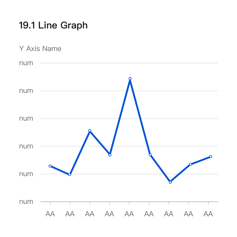
Shows the trend of one or more metrics over a period of time.

On the basic graph, it is necessary to express both reference values and predicted values.

On the basic graph, the Moving Average is used to describe the average change in a series of data points over time to assist in making trend judgements. (For example, in stock market trading, it represents the average price traded over a period of time, and is used to judge the expected current and possible future movements of the market.)

If you need to measure trends in different units, it is best to avoid line plots with two axes, as they can confuse the interpretation of value changes. It is better to use two separate lines that share the same horizontal axis.
Lollipop Graph
- Purpose: Comparison
- Usage: Similar to bar charts. Mainly solves the problem encountered in bar charts due to a large number of, close-together, high values that do not show a difference on the horizontal line. Highlights the current value more.

Network Diagram
- Purpose: Connection
- Usage: The way to visually represent the structure of a network is through a series of nodes and connecting lines forming a mesh.

Parallel Coordinates Graph
- Purpose: Trend, Multidimensional
- Usage: Visualise an individual data point of multiple variables. Each variable corresponds to a vertical axis, and each data point is shown as a series of connected points along the axis.

Pie Chart
- Purpose: Part-to-whole, Diff
- Usage: It is best used when there are only 2 or 3 slices, and when the exact value of each slice is not needed immediately. The maximum number of slices is ten, and the tenth will combine the subsequent ones into the others. When using it, note that the values are ordered from largest to smallest to improve reading efficiency.

Polar Chart
- Purpose: Distribution
- Usage: Display multivariate data in the form of two-dimensional plots, and represent data along radial and angular axes.

Radar Chart
- Purpose: Comparison
- Usage: Suitable for comparing multiple dimensions as a whole, whether they are balanced as a whole or stand out individually.

Scatter Plot
- Purpose: Correlation, Diff
- Usage: Suitable for exploring correlations between different metrics.

Needed to explore the relationship of data points between two sets.

Needed to highlight variations between similar values and reveal differences between data sets.
Strip Chart
- Purpose: Distribution
- Usage: Similar to a one-dimensional scatterplot.

Sunburst Plot
- Purpose: Nominal, Part-to-whole, Multidimensional
- Usage: Suitable for visualising hierarchical data from root to leaf nodes, similar to icicle charts. Demonstrates the categorical share of multi-layered data.

Needed to display naturally hierarchical data.

Needed to display structured hierarchical data.
Ternary Plot
- Purpose: Comparison, Distribution
- Usage: Describes the ratios of three variables as positions in an equilateral triangle. Widely used in three groups of data comparison, filtering, through the ternary diagram can be visualised to show the distribution of data in the three groups, efficient filtering of outlier elements, and at the same time with the analysis of variance and other statistical tests can be found in different groups of significantly enriched elements.

Tree Map
- Purpose: Part-to-whole, Nominal, Multidimensional
- Usage: Suitable for scenarios that visualise part-whole relationships between a large number of categories, as long as the data is hierarchical and precise comparisons between categories are not a major issue.

Needed to show the relationship between the parts and the whole.

Needed to show the relationship between the parts and the whole and highlight inheritance.
Tree Diagram / Dendrogram
- Purpose: Connection
- Usage: Shows the structure of the hierarchical data. According to whether the nodes of each layer are displayed or not, they are subdivided into dendrograms and clustered dendrograms. The former is suitable for hierarchical presentation and the latter for clusters resulting from hierarchical clustering.

Trendline Chart
- Purpose: Trend, Correlation
- Usage: The line overlaps on the chart reveal the general direction of the data.

Violin Plot
- Purpose: Distribution
- Usage: Suitable for statistics of numerical data.

Word Tree
- Purpose: Connection
- Usage: Suitable for showing which words most often come after or before the target word, or for showing the hierarchy of terms.

Waterfall Chart
- Purpose: Diff, Part-to-whole
- Usage: Suitable for scenarios where it is important to understand how an initial value (such as net income) is affected by a series of positive and negative values. A running total is shown to increase or decrease as the value increases or decreases. Each bar is distinguished from the positive and negative by colour.

If it does not represent change over time, use a horizontal waterfall plot with horizontal bars.

If representing change over time, use a vertical waterfall chart with vertical bars.
Wind Rose Chart
- Purpose: Distribution
- Usage: Suitable for visualising the distribution of wind speed and direction at characteristic locations.

Colour Usage
Overall, we can divide the colours into:
- Discrete (Categorical) Palettes Categorical Palettes
- Monochromatic Palettes
- Diverging Palettes
- Semantic Palettes
Types of Palettes
Discrete (Categorical) Palettes
Define
- Purpose of the colour palette: Provide as much distinction as possible between data points.
- Data type: unordered categorical variable data with no intrinsic connection between them.
- Usage specification: A specified sequence is required. If the number of categories is deterministic, the default colour palette can be overridden with another sequence.
- Colour specification: Without any semantics.

Discrete (Categorical) Palettes on Light Sample created by Tencent TVision

Discrete (Categorical) Palettes on Dark Sample created by Tencent TVision
Usage

The first colour is required by default.

Used in the scenario of differentiating between categories through colours, use them in the specified order.

Used in the scenario of emphasising one of the attributes in multiple observation dimensions.

Used in the scenario of highlighting and grouping multiple objects.
If the exact number of data categories is known, the following alternative colours can be used to override the default classification sequence:

Alternative Categorical Sequence on Light based on Exact Number of Data Categories Sample, NOT VERIFIED

Alternative Categorical Sequence on Dark based on Exact Number of Data Categories Sample, NOT VERIFIED
Alternatives.


Note: The number of colour palettes has been classified, with selections ranging from six to fourteen colours, and papers suggesting that five to ten colours could be the alternatives by Healey & Christopher in 1996. Some studies on the nomenclature of colour suggested that eight colours can be named in addition to white by David L. Post and Frances A. Greene in 1985. Colin Ware in the article <Information Visualization: Perception for Design> also suggests that nine colours occur in most civilisations in addition to black, white and grey.
Monochromatic Palettes
Define
- Purpose of the colour palette: Highlight intrinsic connections and gradients.
- Data type: Ordered categorical variables with intrinsic connections or order.
- Usage specification: A specified sequence is required. If the number of categories is deterministic, the default colour palette can be overridden with another sequence.
- Colour specification: Single colours have large and small, strength and weakness, warmth and coolness.

Monochromatic Palettes on Light Sample created by Tencent TVision

Monochromatic Palettes on Dark Sample created by Tencent TVision
Usage

Used in the scenario of expressing the ordinal dimensions in multiple objects, such as age groups.

Used in the scenario of expressing through continuous colours in continuous variables.
Diverging Palettes
Define
- Purpose of the colour palette: Highlight the intrinsic connections and gradients of the dichotomies.
Data type: Ordered categorical variables with dichotomous intrinsic connections or sequences.
Usage specification: A specified sequence is required. If the number of categories is deterministic, the default colour palette can be overridden with another sequence.
Colour specification: Bicolours have binary pointers of large and small, strength and weakness, warmth and coolness. Semantic colours are used if the semantics are involved.
In general scenes, just highlight the contrast:

Diverging Palettes on Light Sample created by Tencent TVision

Diverging Palettes on Dark Sample created by Tencent TVision
If you encounter a scene that needs to highlight the absolute difference between good and bad, positive and negative, warm and cold, you can use a divergent colour palette with stronger colour emotions:

Diverging Palettes within Hot & Cold on Light Sample created by Tencent TVision

Diverging Palettes within Hot & Cold on Dark Sample created by Tencent TVision
Usage

Used by default to highlight relativity.

Used in Positive and negative, warm and cold, highlighting absolutes.
Semantic Palettes
Define
- Purpose of the colour palette: to emphasise positive and negative, good and bad, and degree.
- Data type: ordered categorical variables.
- Usage specification: to express categorisation.
- Colour specification: colours have strict semantics.

Semantic Palettes on Light Sample created by Tencent TVision

Semantic Palettes on Dark Sample created by Tencent TVision
Usage

Emphasis on one of them.

Emphasis on positive and negative.

Emphasis on in-range or out-of-range, referring to a zone needs to focus on.

Emphasis on severity.
Quickly Develop Visual Palettes Based on the Brand
- Determine theme colours.
- Select the palette algorithm. Based on the theme colour, use the palette algorithm to develop eight colours with ten gradients for them to get a monochrome palette. (We used our palette tool for this.)
- Select the diverging palettes. From the monochrome palette, select two groups of colours to get the divergent palette.
- Select the discrete palettes. Make a fixed number of colour matches from all the colours.
- Validate the discrete palettes. Verify differentiation, then accessibility. Discrimination needs to meet Delta-E >= 30 between neighbouring colours and can be verified using IwantHue Colours are still recognizable in visual impairments such as red-blindness, green-blindness, et cetera, and can be verified using Viz Palette.
- Selection of Semantic Palettes. Based on the theme colour, using the C and L values of the theme colour as reference values, adjust the C and L values of red, orange, yellow, green and blue with the help of CIElab / HCL colour space, to make the semantic palette and the theme colour maintain a relatively consistent tone, so as with similar saturation and brightness.
Axes and Markers Usage
In addition to the data visualisation itself, we sort and summarise the axes, auxiliary lines, auxiliary graphics, auxiliary text and actions that describe the data, which can be roughly divided into:
- Annotation represents the outer layer of annotation
AnnotationText represents the inner layer of annotations.
Anomalies
Certainty represents certainty
Emphasis
Gaps represent data breaks
Interval
Scope
Tooltip
Types of Axes and Markers
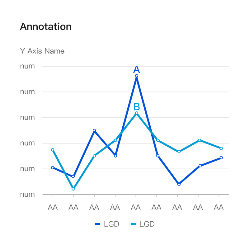
Annotation
- Display annotations on the chart near the data points. The display of annotations does not require any user interaction.
AnnotationText
- AnnotationText that is displayed when the user hovers over the relevant annotation.

Anomalies
- Displays anomalous data points on a chart. This is often combined with user interaction, such as hovering over the text that appears.

Certainty
- Indicates whether a data point is a given, fact that has occurred or a speculative, prediction that has not occurred. How it is displayed depends on the type of chart, such as solid lines versus dashed lines in the line chart.

Emphasis
- Emphasises the specified chart data points. Displayed as thick lines and/or large dots. For line and area charts, the line segment between two data points is emphasised when data points are emphasised.

Gap
- Do not interpolate between two periods when data are unavailable. Always label the start and end points of data unavailability.
- Ideal for when you need to see the whole scene without distortion, use a sine line instead. x-axis fixed 16px, y-axis minimum 16px.
- If there is no data between axis breakpoints, leave the area empty.

Interval
- Indicates the range of potential data for a particular data point, using the 𝐼 shape to represent the range, with upper and lower thresholds. such as confidence intervals.

Scope
- Indicates whether a point is in or out of range. If a point is out of range, it is not visually emphasised. For line and area charts, the period is in range if either endpoint between two data points is in range.

Tooltip
- The text is to be displayed when the user hovers over the data point.

Graphical Semantics Usage
In addition to colour semantics, the data itself also has semantics. Data may represent:
- Actual Values
- Projected Values
- Reference Values
Graphical Semantic Types
Actual Values
- Meaning "are", real values.
- The solid pattern in the line graph.
- The solid pattern in the column chart.


Predicted Values
- Meaning "might be", values that might occur.
- The dashed line in the line graph.
- The hatched areas in the column chart.


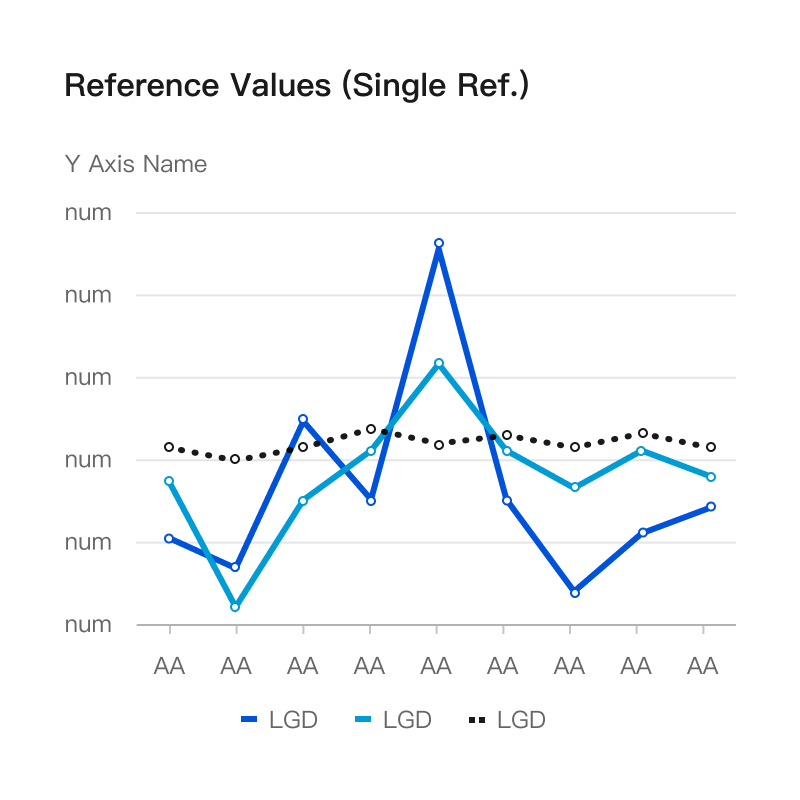
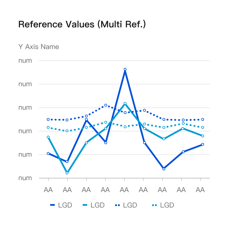
Reference Values
- Meaning "should be", the value that should appear.
- The bullet chart already contains the reference line and can be expressed directly.
- The dotted line and empty circle in the line graph.
- The empty area in the column chart.





References
© 2024 Xiang PENG. All Rights Reserved.