
Competitive Analysis of Tencent Careers Site
2018|Type: Original|Tag: Research
Report Set
Background
The Tencent Global Recruitment Website, which currently serves the US region and South Korea, is not rich in content. There is uncertainty about the site’s main function, what content needs to be provided to users, and how to organise the content.
Purpose of Competitive Analysis
The purpose of this is to understand the current situation and usability of the local and global market in hiring through competitive analysis and user research reports.
The Addressed Proposes
- What are the key features and content of competitors
How is the information architecture of competitors
How is the usability of competitors
The Scope
- Part I: Content and Function, Information Architecture
Part II: Interaction Design
Analysis Method
- Part I: Basic statistics on competitors’ content and function, and information architecture
Part II: Self-reported metrics and performance metrics
Analysis Setting
- Part I: Selecting 30 companies’ recruitment websites related to the region and the main business of Tencent, and performing data statistics on the content of the website and the organisation of the information.
Part II: Usability testing was performed on SUS, task success, task time, and awareness of 6 competitors, using data from 9 international interns as a sample.
Part I: Content and Function, Information Architecture
The Selected Competitors
Select global companies that are in direct competition with Tencent based on their main business as mentioned in the company's financial report.
Businesses include communications and social media, online games, digital content, online advertising, and others (payments, cloud services). The countries (regions) to which the company belongs include the United States, the United Kingdom, Australia, China, Japan, South Korea, and India.

Summary
- Site Independence: More than 2/3 of the sites have a separate recruitment site from the company website.
Layout: 93% of sites use top navigation.
Homepage and Navigation: More than two-thirds of US companies and half of non-US companies correlate homepage and navigation.
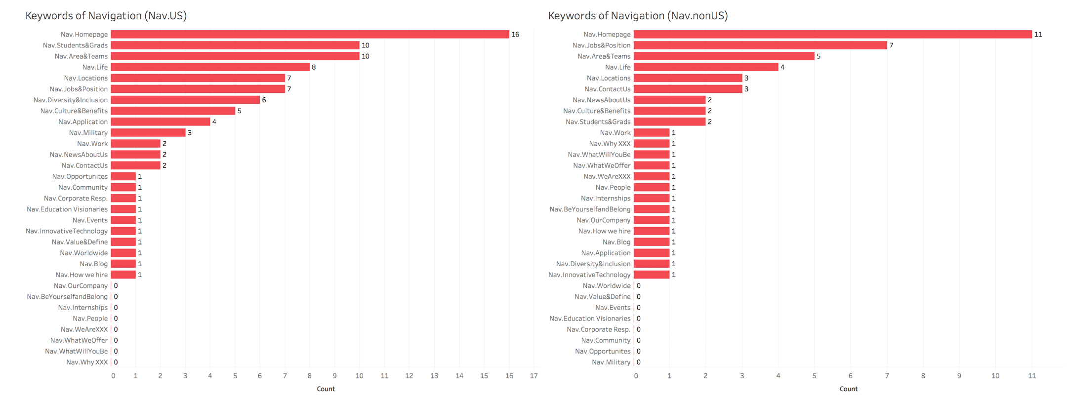
Top 3 Navigation Keywords: US companies: Students & Grads, Areas & Teams, Life. Non-US companies: Jobs & Positions, Areas & Teams, Life
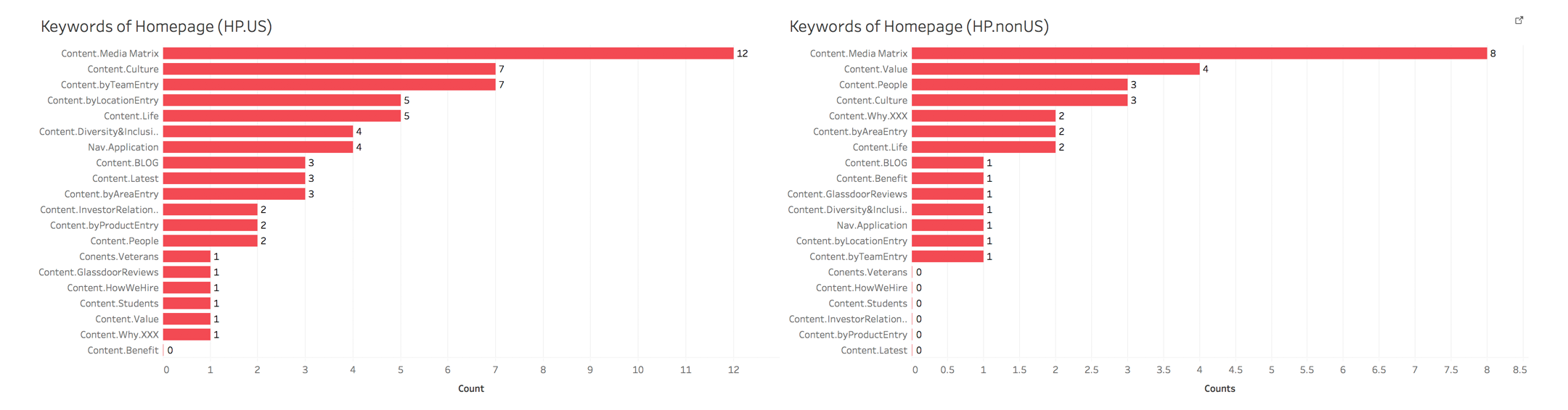
Top 3 Homepage Content: US: Culture, Team Introduction, Location Introduction. Non-US: Value, People, Culture
The first screen of the Homepage: Image is the main material, and ‘image + search + slogan’ shows as a standard paradigm.
Homepage structure: Nearly half of the sites direct users to sub-categories of jobs below the home page image.
Reports
Site Independence
More than two-thirds of the sites have a separate recruitment site from the company's website and companies that don't have it can be categorised in two ways:
- In general, they are unicorns in a certain field and also have an intense business area, such as Deepmind, and Line.
- The website carries everything the user (consumer, customer) needs to know, including introductions, buying channels, solutions, jobs, et cetera, such as Apple, and Samsung.

Layout
93% of sites use top navigation, which is the most common way of laying out a web page, among other things:
- Two US gaming companies, Activision Blizzard and Electronic Arts, use left-side navigation.
- Amazon's jobs site has right-side navigation. It's also worth noting that Amazon's business teams, such as AWS, have left-side navigation.

Homepage and Navigation
The homepage of the recruitment website or the recruitment page of the main website has a logical relationship with its navigation in the way it organises its content and conveys information, and it is a summary of the overall content of the recruitment, with a certain degree of relevance. The relevance is expressed in the further elaboration of the navigation, which provides function access, sub-category access, and so on:
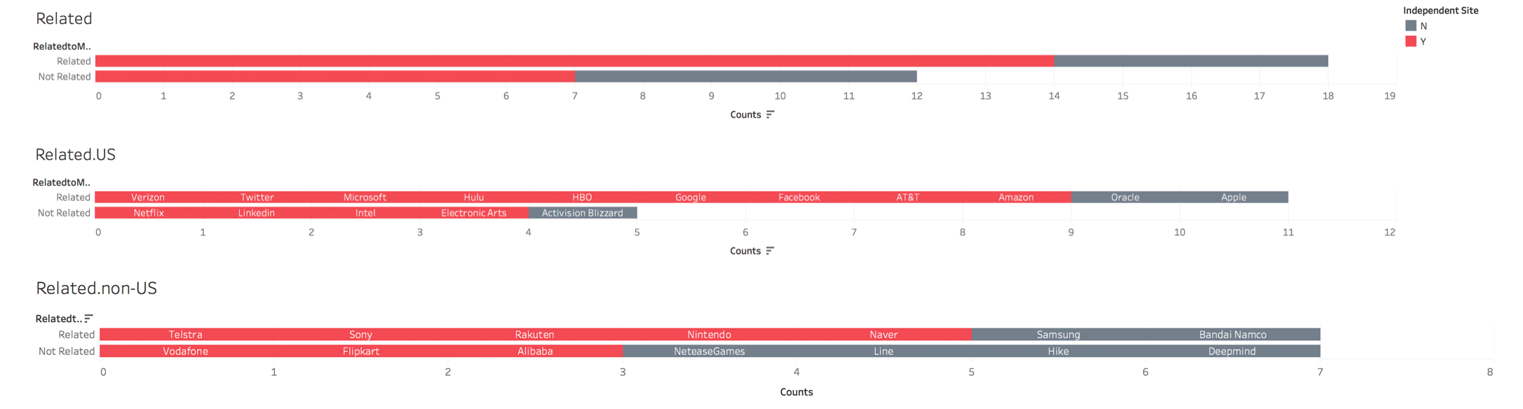
- More than two-thirds of the 16 U.S. companies have relevance, and half of the 14 non-U.S. companies have relevance.
- Of the 18 independent recruitment websites, 77.8% are relevant.
Among the 8 samples with no or poor relevance, the following characteristics were found:
- Navigation provides access to functions, while the homepage shows the history of the company, the CEO's entrepreneurial story, and the value and influence of the company, such as Linkedin, and Flipkart.
- The homepage provides function access, while the navigation shows its story, such as Rakuten, and Vodafone.
- The content of the homepage is composed of deeper material in the function, such as ntel, and EA.
Top 5 Navigation Keywords
The top 5 keywords displayed in the navigation bar on the homepage are:
- US companies: Students & Grads, Areas & Teams, Life, Locations, and Jobs & Positions
- Non-US companies: Jobs & Positions, Areas & Teams, Life, Locations, and Contact Us
Top 5 Homepage Content
The top 5 keywords for information on the homepage are:
- US companies: Culture, Team access, Location access, Life, and Diversity & Inclusion
- Non-US companies: Value, People, Culture, Why here, and Area Access
In addition to this, the bottom of the homepage usually has a media matrix such as G+, Facebook, Instagram, Twitter, and Linkedin.
The first screen of the Homepage
Images are the general first screen materials, and ten over sixteen US companies and six over fourteen non-US companies have adopted a standard paradigm of image + search + slogan’.

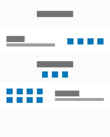
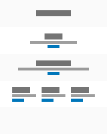
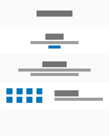
Homepage structure
How information is organised with each other.


A
B
C
D
E
- A: about half of the companies use this structure, guiding users to access sub-categories, with rich jobs and multidimensional filters, such as Amazon.
B: Nearly one-third of companies use this structure, organising the homepage through rich material, with a predominantly digital content business, such as Facebook.
C: About one-sixth of companies use this structure and usually do not have a separate site, such as Samsung.
D: A few companies use this structure, with less content and more text, such as Alibaba.
E: Mainly combines features of descriptive and narrative text, with a wide range of businesses, such as Google.

Part II: Interaction Design
Framework
Life Circle
- Pre-task: browsing the site to measure awareness of the competitor's homepage content.
Task testing: measure the performance of the main user flows on the competitor's website.
Post-task: scoring to measure the usability of the website.
Method
Verbal Reports
Before the task, the user is encouraged to navigate and explore the content of the website to simulate a real-world environment. Self-statement through recall. Based on a recall of the content and function of the homepage, a verbal report describing the site allows for an initial brand impression of competitors.
- Indicator: Awareness
Performance Metrics
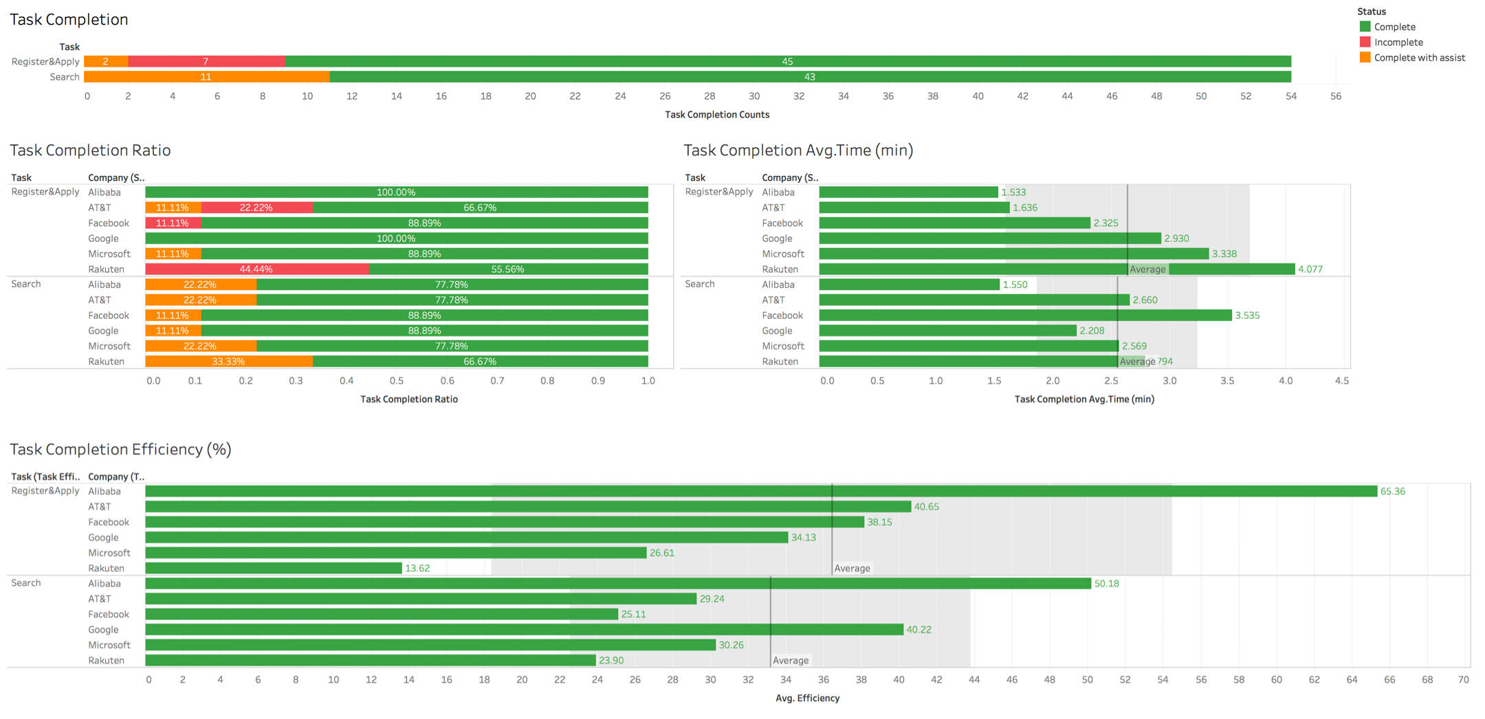
Task Success is the most commonly used usability metric, only a task needs to be defined to measure the success of its flow. Time-on-task is the best way to measure the efficiency of a product. In most cases, the faster a participant completes a task, the better their experience.
- Task Success in Degree: No Problems (completed independently), Some Problems (assisted with completion), Failure/Abandonment (incomplete, abandoned).
Time-on-Task: The facilitator decides when to finish, only time-on-task from successful tasks is used.
Efficiency: Task success rate / Time-on-task * 100%
System Usability Scale, SUS
SUS is one of the most widely used tools for assessing the perceived usability of a system or product. It consists of 10 declarative sentences, half positive and half negative. Uses a 5-point agreement scale that converts to 100 points.
- < 50: Unacceptable
- 50~70: Threshold
- > 70: Acceptable
SUS produces more consistent scoring results in smaller samples than QUIS, CSUQ, or Microsoft Desirability Toolkit. Usability studies of different designs with similar tasks have used SUS as a comparison method.
Task in Scenario
- Scenarios: Ram, a designer of Indian origin who has been an interaction designer in California for five years, has recently been thinking about his career plans and believes that he has reached his limit in his current job, and would like to devote himself to design research in a specific area, considering a different job in California, and also considering a move to Texas.
- Task 1: Browse through the content of the website, recalling and verbally answering where to look for information about which companies and what is on the homepage.
Task 2 (Timing by verbally speaking ‘start’ and ‘finish’): Return to the homepage and find an experienced design job in California or Texas that matches your qualifications and years of experience in the job description.
Task 3 (Timing by verbally speaking ‘start’ and ‘finish’): Apply for the position and complete the whole process before clicking the submit button.
Participants
9 interns, 2 from Taiwan, 3 from the US, and 4 from China.
Scope of Analysis
Based on region and business, and considering the structure of the homepage, 6 competitors were selected from the 30 competitors for specific analyses.

Summary
Verbal Reports
- Alibaba: lots of text.
AT&T: lots of video and tech.
Facebook: useful process, clean interface.
Google: less information, highlight search.
Microsoft: prominent characters, professional and rigorous.
Rakuten: very prominent data dynamics.
Performance Metrics
- Task 2: Jobs-Search
- Users completed 79.63% of tasks independently.
- The average time spent by users at Alibaba and Google is lower than the average, with the lowest time at Google and a stable time at Alibaba.
- The top three in terms of efficiency are Alibaba, AT&T, and Facebook, all of which are 36.42 above the average.
- Task 3: Register and Apply
- Users completed 83.33 per cent of tasks independently.
- The average time spent by users at Alibaba, AT&T, Facebook and Google is lower than the average, with the lowest time spent at Alibaba and a stable time at AT&T.
- The top 3 in terms of efficiency are Alibaba, Google and Microsoft, with the top 2 above the average by 33.15.
Besides, the login status of Google and Facebook may have a greater impact on task time and efficiency, and new user registration may have a greater impact on task completion.
System Usability Scale (SUS)
- The overall usability of Google, Facebook, and Microsoft websites is acceptable for reference.
- The overall usability of Rakuten is not acceptable.
Reports
Verbal Reports
Alibaba
- Homepage: Culture, Vision, and Location
- Aha moment: None
- Feelings: Lots of text
AT&T
- Homepage: Videos, Culture, and Life
Aha moment: Video
Feeling: Technological, Young, and Energetic
- Homepage: Why Choose, Recruit Flow and Culture
Aha moment: None
Feeling: Clean, Inspirational
- Homepage: Search, Slogan, or No Impression
Aha moment: Search, Slogan
Feeling: Clean, Less Information
Microsoft
- Homepage: Search Access, Why Choose, and Employee Story
Aha moment: Black Female Employee
Perception: Professional, Rigorous
Rakuten
- Homepage: History, CEO Words, and Location
Aha moment: Animations, Data
Feel: Storytelling, Diversity
Performance Metrics
1. Task Success
- Task 2 (Jobs-Search): 79.63 per cent independently completed and 100 per cent completed (with assistance).
Task 3 (Register and Apply): 83.33 per cent of tasks were completed independently and 87.04 per cent of tasks were completed (with assistance).

2. Time-on-Task
- Task 2 (Jobs-Search)
- There are three outliers in the data, and all of them are eliminated after checking.
- The top three companies with the shortest search times are Alibaba, Google, and Facebook.
- One company, Alibaba, has a search time that is less than half that of the other companies.
- There are two companies whose search time is lower than the average time of their competitors, Alibaba and Google.
- Google is the lowest and Facebook is the highest in Quartile 1.
- In the InterQuartile Range (IQR), Alibaba has the shortest and most concentrated variable, while Rakuten has the longest and most dispersed variable.


- Task 3 (Register and Apply)
- There were three outliers in the data, all of which were eliminated after checking.
- The top three companies with the shortest registration and application times are Alibaba, AT&T, and Facebook, in that order.
- One company, Alibaba, has a search time of less than half the average.
- Four companies had search times below the average of their competitors, Alibaba, AT&T, Facebook, and Google.
Alibaba has the lowest and Rakuten the highest in Quartile 1. - In the InterQuartile Range (IQR), AT&T has the shortest and most concentrated variable, while Microsoft has the longest and most dispersed variable.


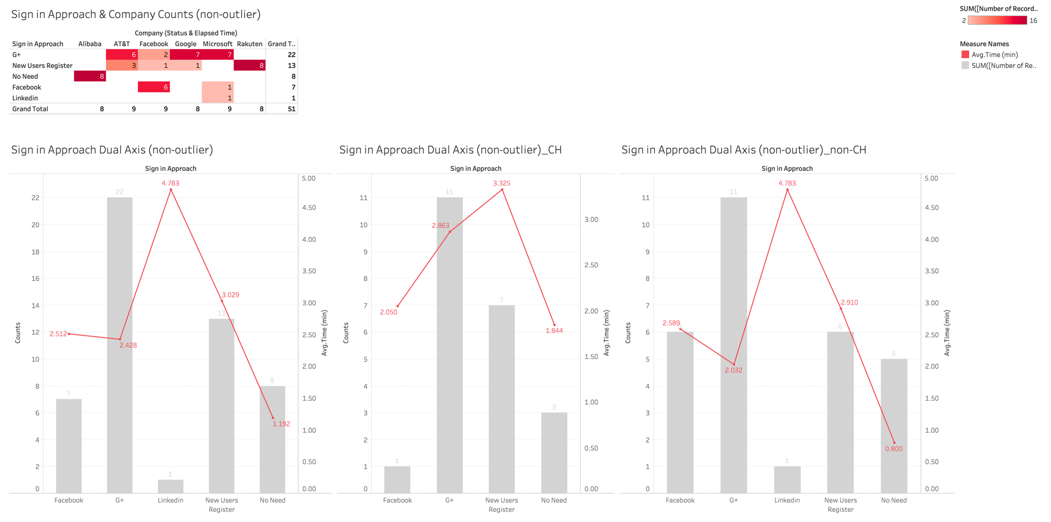
- The Effect of Registration on Time
- There were three outliers in the data, all of which were eliminated after checking.
- There is one company that does not require registration, namely Alibaba.
- Login time with Facebook is 0.539 min faster in China than in non-China.
- The login time using G+ is 0.831 min slower in China than in non-China.
- New user registration is 0.415 min slower in China than in non-China.
3. Efficiency (Task success rate / Time-on-task * 100%)
- Task 2 (Jobs-Search)
- The top three in efficiency are Alibaba, AT&T, and Facebook, in that order.
- The average efficiency is 36.42, and the top three companies are all above average.
- Task 3 (Register and Apply)
- The top three companies in terms of efficiency are Alibaba, Google, and Microsoft.
- The average efficiency is 33.15, with only the top 2 companies above average.
System Usability Scale (SUS)
- Alibaba had two outliers, one of which was found to be inconsistent with the participants' feelings and was eliminated.
- Three companies scored above 70 and had acceptable usability: Google, Facebook, and Microsoft.
- One company, Rakuten, scored below 50 and had unacceptable usability.
- There are two companies in the critical range, Alibaba and AT&T.
- Google is the highest and Rakuten is the lowest in Quartile 3.
- In the InterQuartile Range (IQR), Alibaba has the shortest and most concentrated variable, while AT&T has the longest and most dispersed variable.


© 2024 Xiang PENG. All Rights Reserved.